WordPress Twenty Sixteen Theme: Move Content to the Left
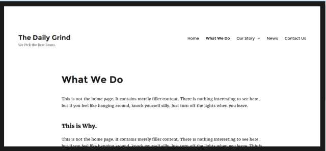
The Twenty Sixteen theme provides a great starting point for a clean, modernly-designed, responsive site. Among the things I find limiting about it, however, is the way page content sits in the center on pages that don’t show sidebars. There’s too much white space, especially to the left of the content:

But here’s a quick way to fix that. And you don’t even need to create a child theme.
Just use a CSS plugin, such as Jetpack Custom CSS or SiteOrigin CSS. Once you have the CSS editing form open, input the following code snippets to reduce white space and justify the content to the left (where it lines up better with the site title and / or site logo). Don’t forget to save your changes and refresh the site in your browser before viewing your updated site.
Use this code to remove the home page sidebar:
[hr]
.entry-content, .entry-header {
margin-left:0% !important;
margin-right:auto;
}
/*For browser/screen widths less than 880px – adjusts left margin for small screens */
@media screen and (max-width: 880px) {
.entry-content, .entry-header {
margin-left:7% !important;
margin-right:5%;
}
}
[hr]
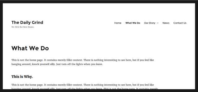
And there you have it:

Two very simple CSS snippets that make the Twenty Sixteen theme more conducive to a variety of Web site types, not just blogs. Enjoy!
