Make Your WordPress Twenty Ten Theme Responsive
I know, I know…it’s 2014. WordPress.org has stopped updating the Twenty Ten theme. Most WordPress users have moved on to themes Twenty Twelve and higher.
However, you may have well-designed child themes based on the old Twenty Ten theme, a fixed-width parent theme that, nonetheless, has a lot to like. It’s solid and easy to customize (even with only modest HTML, CSS, and PHP knowledge). What’s more, it plays nicely with Internet Explorer 8, a browser the later default WordPress themes do not.
I discovered that last bit when I tried to redo this Web site with a Twenty Twelve child theme. After a bit of tweaking and fiddling, I had something close to what I wanted – until I saw it in IE 8. Yikes!
A Cranky Child
For one thing, I could not get the primary navigation bar to look precisely the way I wanted it, in any browser. It looked especially wonky in IE 8. So, I abandoned my attempt to create a Twenty Twelve child theme and set about trying to make this one, which I call 2010 Matera, responsive.
For those of you not familiar with the term, responsive (as it pertains to Web pages) means that page layout and content are fluid, changing shape and size to fit stylishly on anything from smartphones and small tablets to full-size desktop monitors.
Before I got far pondering what I’d need to do to make my Twenty Ten child theme responsive, I Googled for solutions. That’s when I discovered a fantastic plugin: Responsive Twenty Ten.
I was skeptical. But it really works!
That said, I ran into two minor hitches:
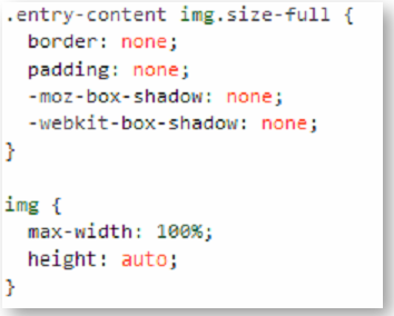
- The header image didn’t automatically adjust to screen size.
- The plugin adds shadows and borders to images.
Luckily, the fixes for those issues were quick and easy. Just add the following code to your child theme’s stylesheet (or, if you prefer, to the “Edit CSS” screen if you’re using the Jetpack plugin):

That’s it. Your child theme is now fully responsive, without any discernible changes from its original appearance when viewed on a full-size screen. When viewed on smaller screens, however, it will flex to fit the resolution and shape of the viewing area.
[hr]
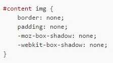
UPDATE: JUNE 5, 2015 – I ran into an issue on a client’s Web site. The shadow and border didn’t disappear after I added the above code. If that happens to you, just add this to your CSS (along with the above code):

[hr]
Making a Few More Adjustments
Nevertheless, you may need to make minor tweaks after testing on smaller screens. In my case, I reduced the number of top-level menu buttons on this site’s primary navigation. I also redid my contact forms to make sure they, too, were responsive (no big deal if you’re using the Contact Form 7 plugin). Beyond that, as long as you didn’t add any fixed-width options to your child theme’s CSS, your site should be a lot more compatible with an array of portable devices.
And, it”ll be compatible with good ‘ol Internet Explorer 8. I know that usage of that browser has dwindled markedly. But I still find Windows XP workstations and public computers on which that old browser is the default option. It’s nice to know my pages look just as I intended, even on those antiquated clunkers.
So, if you have any nicely-designed Twenty Ten child themes, give Responsive Twenty Ten a try. It’ll let you get a lot more mileage out of ’em. Meanwhile, feel free to share your own responsive Twenty Ten adventures.
[hr]
Note: the creators of the plugin seem to have a newer version on their own Web site. So, if you don’t want to download it through your WordPress dashboard (from the official plugin directory), you can download the official version here.
For the record, I used the official version, which I installed from the WordPress plugin directory, even though the plugin had also been available from the plugin authors’ Web site. It no longer seems to be available from the latter, so go with the official version.
Meanwhile, for more info on making child themes (including an overview and the advantages of creating them), click here.

One Comment