Is Your WordPress Site Ready for Google’s Mobile Algorithm?
April 21, 2015 has come and gone – and with it Google’s deadline to ensure that your Web site is mobile-ready. That is, your Web site should display clearly on multiple devices, particularly smartphones and tablets. If it doesn’t, then Google may rank it lower in mobile search results.
How to Tell if Your WP Site Is Mobile Ready
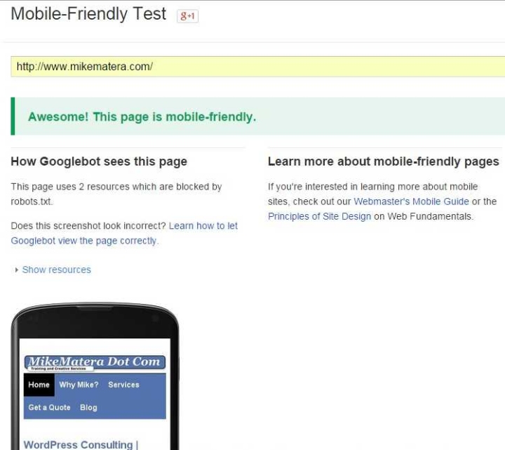
The most reliable way is to enter your URL into the form on this page:
It takes under a minute to see your results:
Did your site pass? If not, I’ve got some quick fixes – if you’re using WordPress.
WordPress Mobile-Ready Plugins
There’s a plugin to get your WordPress site or blog to do just about anything. It’s too bad life doesn’t work that way (unless there’s a plugin I’ve not yet heard of).
When it comes to making your pages smartphone-and-tablet-friendly, here are three of my favorites. The first two will fix the problem automatically, generating mobile versions of your pages whenever anyone visits your site with a tablet or smartphone. The third one will help you test a potentially responsive WordPress site in various simulated phone and tablet screens to see how it fares.
WP Touch
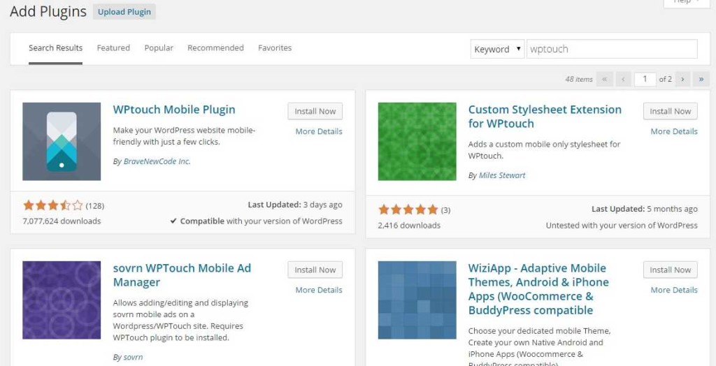
If you’re not already using the Jetpack plugin, then WP Touch is your quickest solution. Just download and install it from your WordPress dashboard (Dashboard >> Plugins >> Add New):
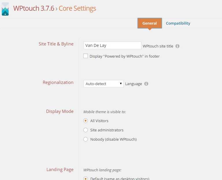
Once you install and activate it, go to its settings menu and choose the options you want. The free version only comes with the Bauhaus theme, so there’s not much you can do, via the plugin interface, to change your mobile site’s look. That said, the default settings will work fine for most site owners, and you’re not required to provide a link to the plugin author (the “powered by” box is unchecked by default).
From the “WP Touch >> Core Settings” screen, set the menu you want to use for your mobile site. Next, scroll down to preview your site:
That’s it. Now go ahead and test it on your phone or tablet. If need be, edit your blog / site title so that it looks good on a small screen (if either bit of text is too long, you’ll see what I mean).
In any case, WP Touch won’t affect how your site looks on a desktop or laptop. It’s programmed to redirect viewers on mobile devices to an alternate, mobile version of your site – though it also provides a “full site” option to mobile visitors.
Jetpack Mobile Theme
Jetpack is a great addition to any Web site. It’s a mega plugin, made by the same people who make WordPress, and it adds a TON of features to your WordPress installation.
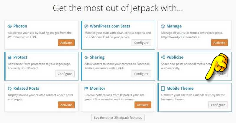
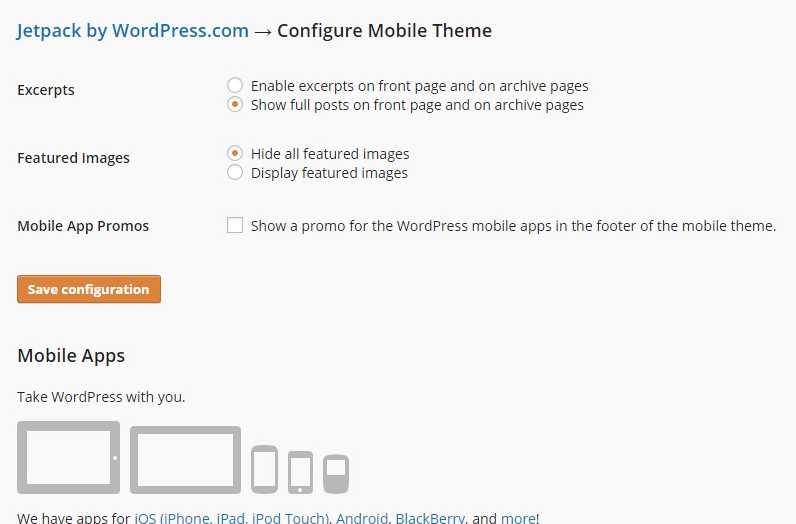
One of them is Jetpack’s Mobile Theme. All you need to do is activate and configure it:
Once it’s running, it will automatically serve mobile-ready pages to anyone accessing your site on a tablet or smartphone. As with WP Touch, each page has a link at the bottom that allows visitors to switch to the full version if they choose.
Responsive Page Tester
Jetpack and WP Touch provide effective quick fixes for any non mobile-ready (responsive) site, automatically diverting smartphone and tablet visitors to a separate, mobile version of your site. If you are, however, using a mobile-ready theme, then the Responsive Page Tester plugin will let you view your pages on a number of different simulated mobile device screens.
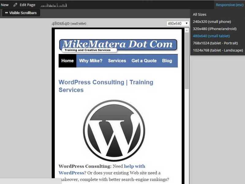
Download and install it as you would any other plugin. Once you activate it, you won’t notice anything different until you view the front end of your site (while you’re still logged in as administrator). Then, you’ll see the word “Responsive” in the upper right (along the black band you normally see when you’re logged in). Click on that and you’ll see a number of different viewing options, including all sizes at once and individual screen simulations.
Responsive Page Tester won’t display your site in true mobile form if you’re using either the WP Touch or Jetpack Mobile plugins. Those plugins will only generate mobile-friendly pages on phones or tablets. Responsive Page Tester is useful for when you’re already using a mobile-friendly theme and you want to tweak its design.
Yes, it’s a new era in online search. While responsive design has gained popularity since the late 2000s, it’s now becoming the Web standard. As more of us access the Internet from smartphones, tablets, and wearable devices, it’s imperative that your Web site display properly and promptly to all potential visitors – not just those on laptops and PCs.


One Comment